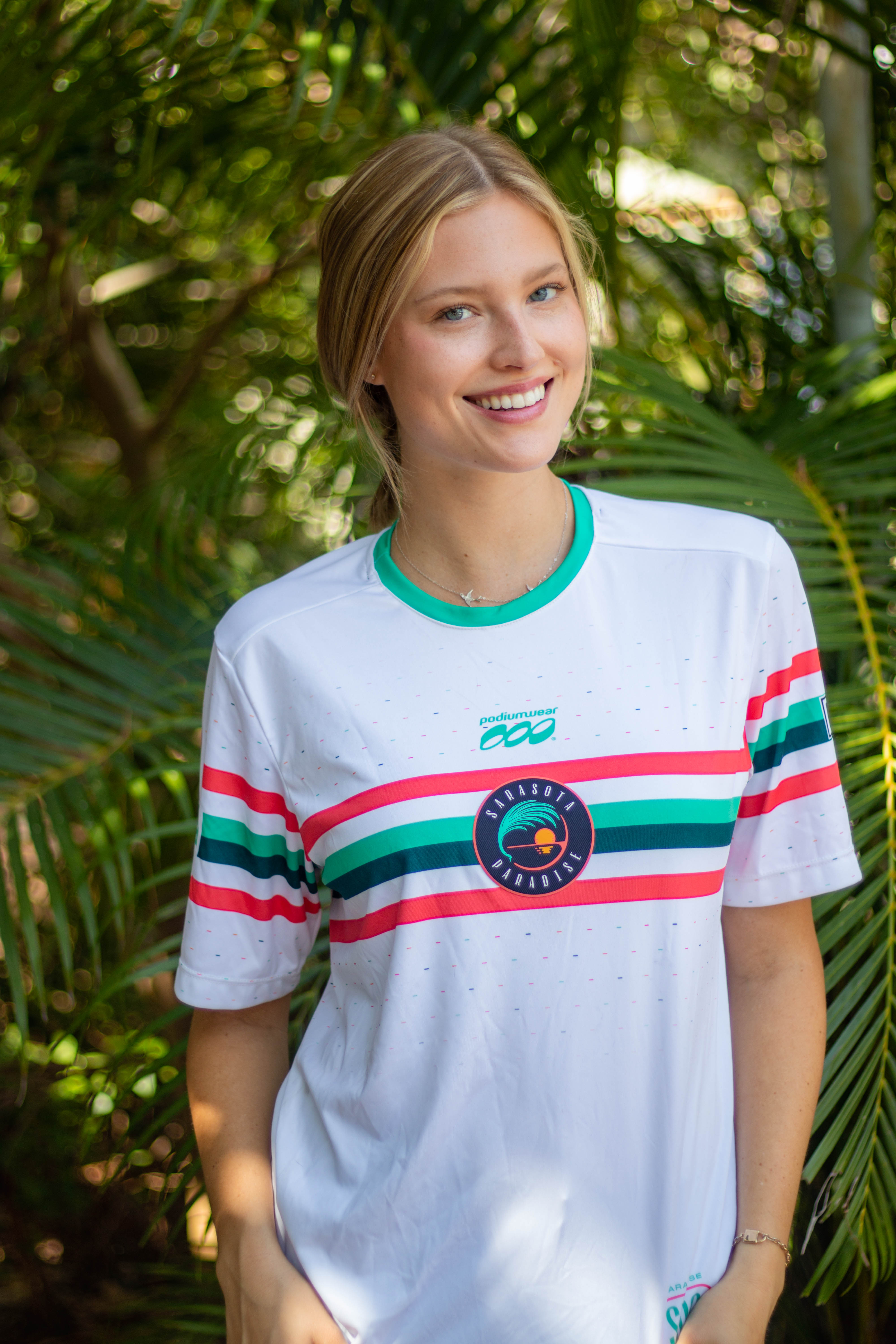
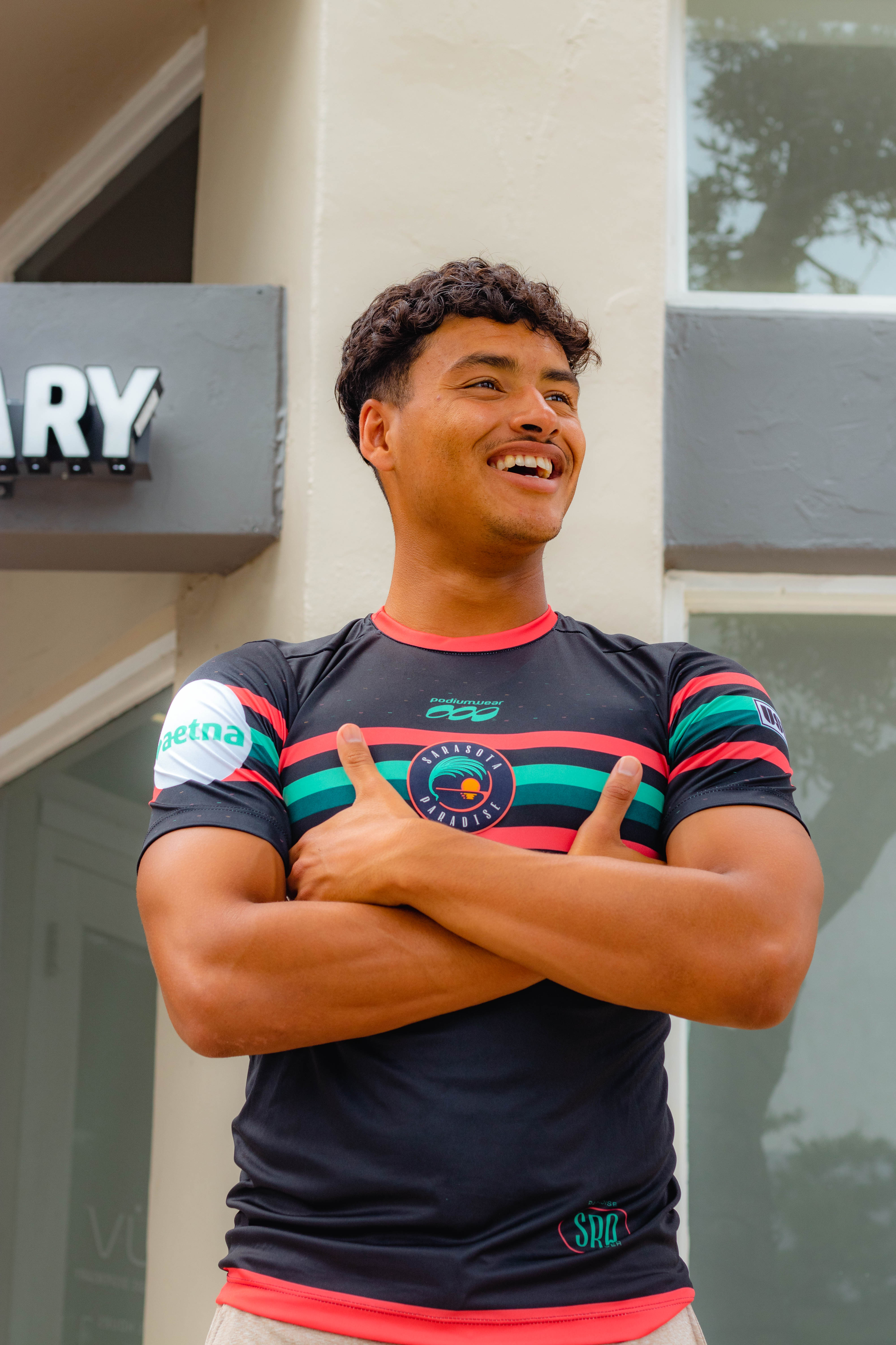
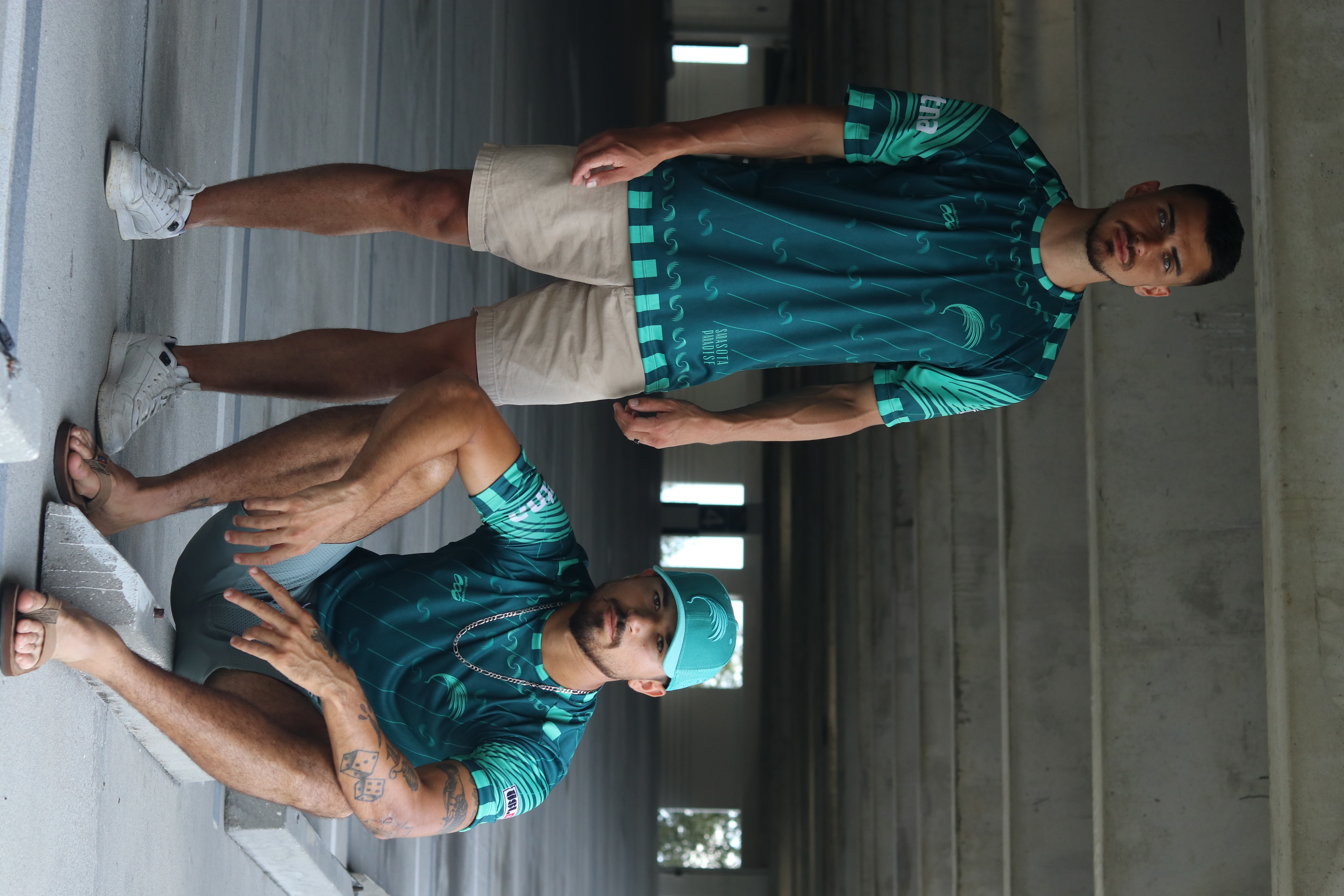
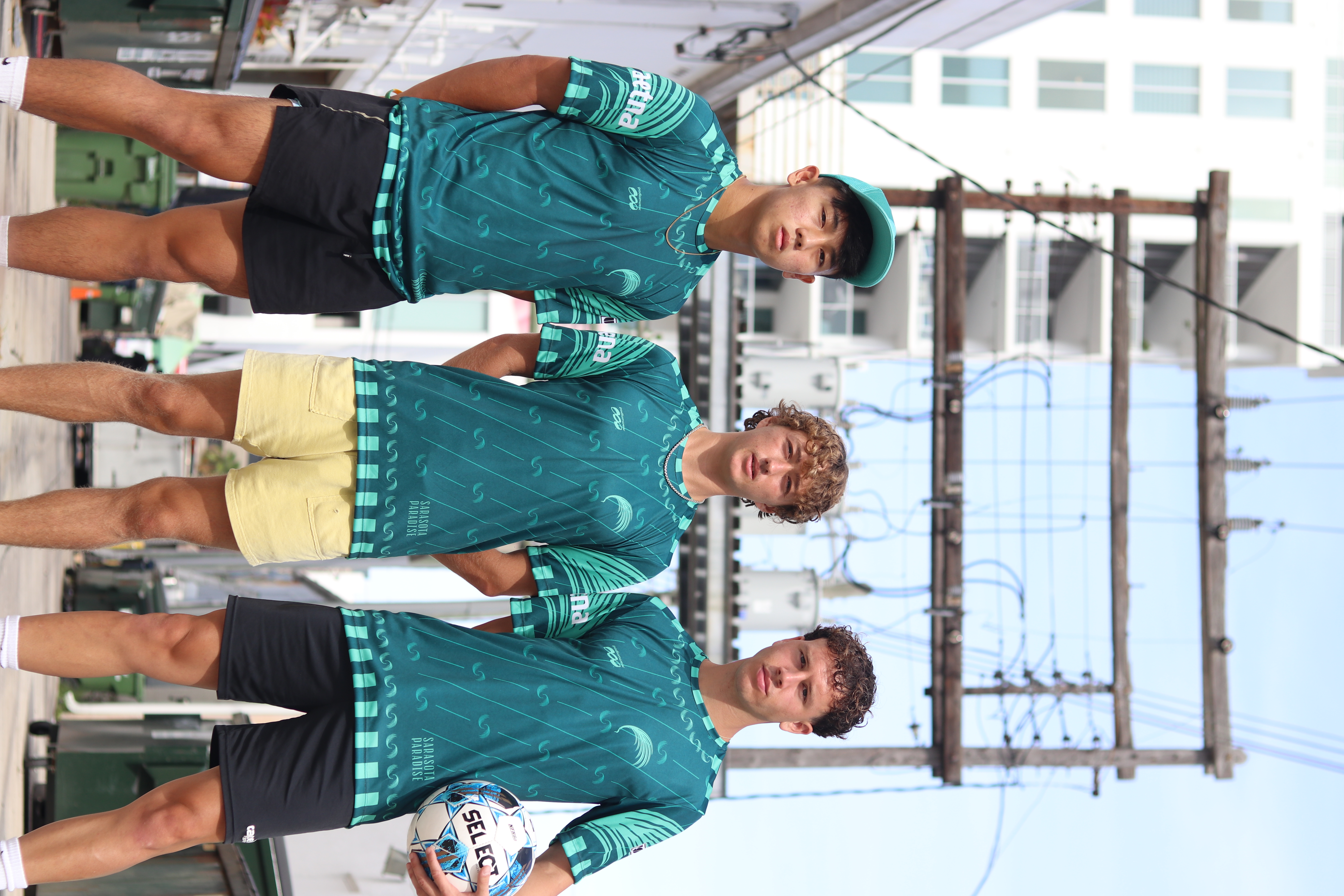
Sarasota Paradise
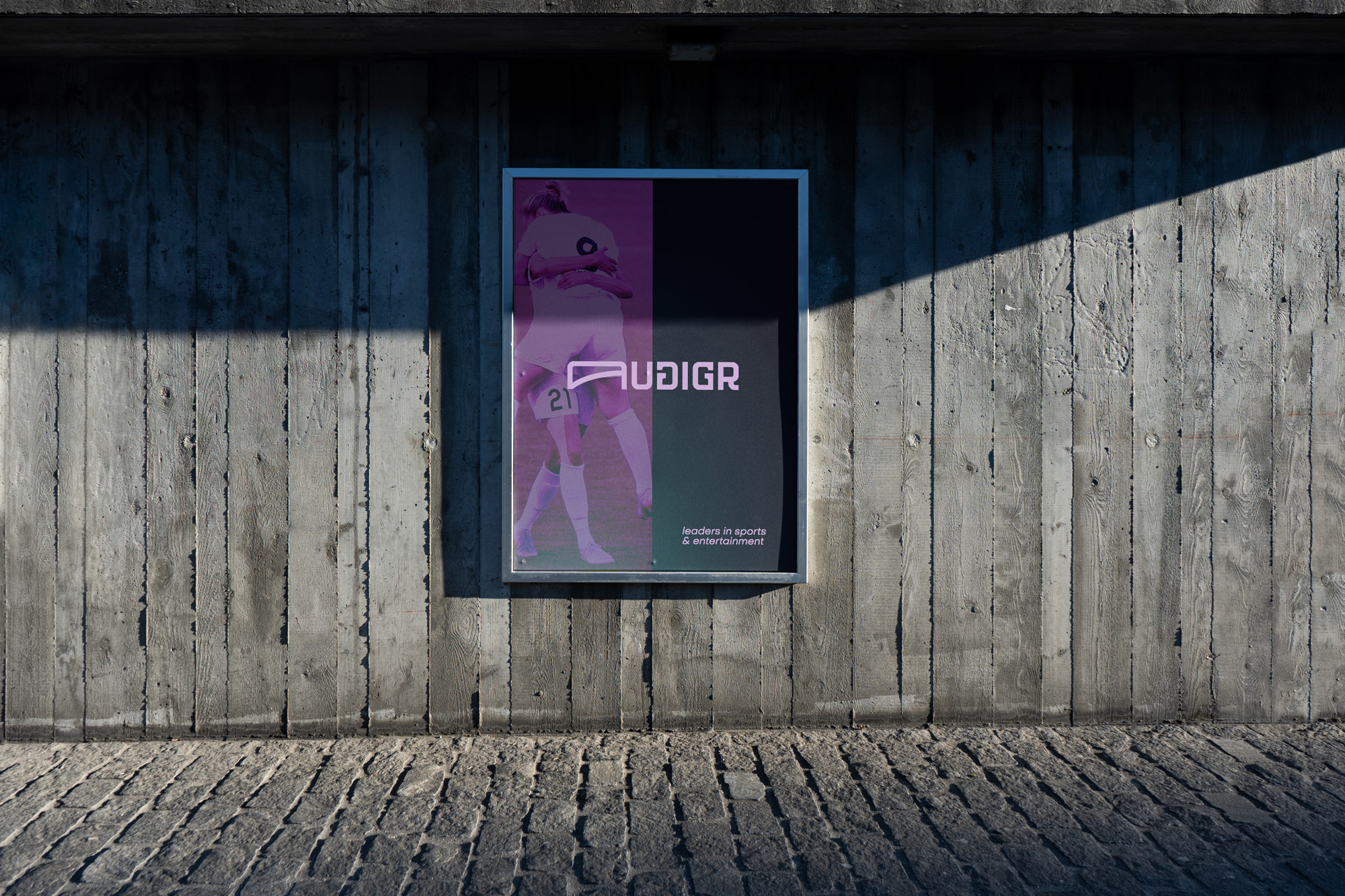
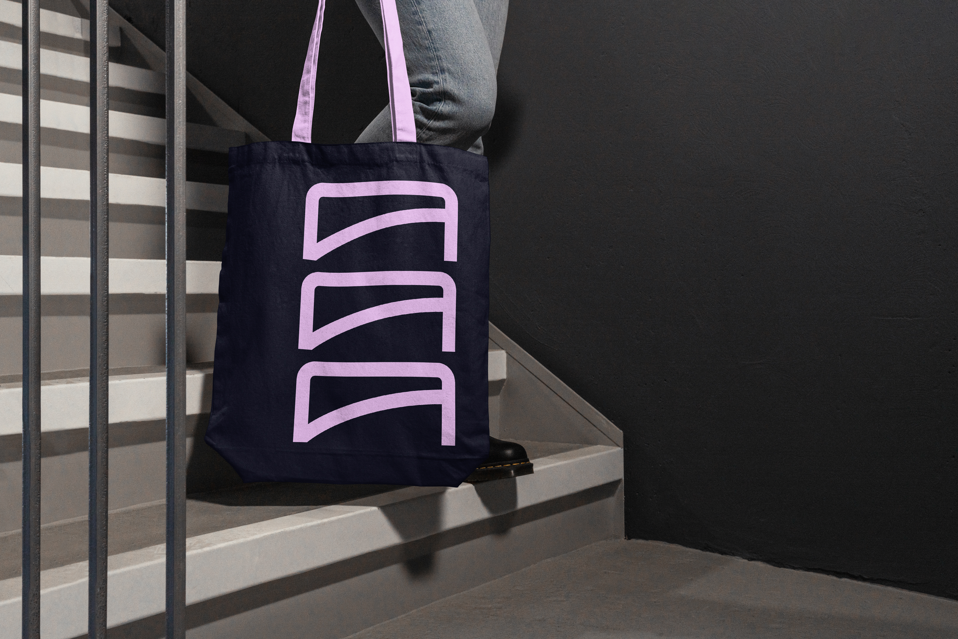
Audigr Group
Sarasota, USA
2022
Sarasota, USA
2022
Brand development and creative direction for a United Soccer Leagues club in Florida.
With ownership, we set the project’s tone as a high-level semipro team to start, with professional ambitions. Sarasota is a large city, with an identity distinct from its regional neighbors, including a more diverse and increasingly younger demographic.
As Sarasota’s hometown team, comprised of local players and staff, a clear mission and brand was essential to best represent the city at the highest sporting level domestically and beyond.


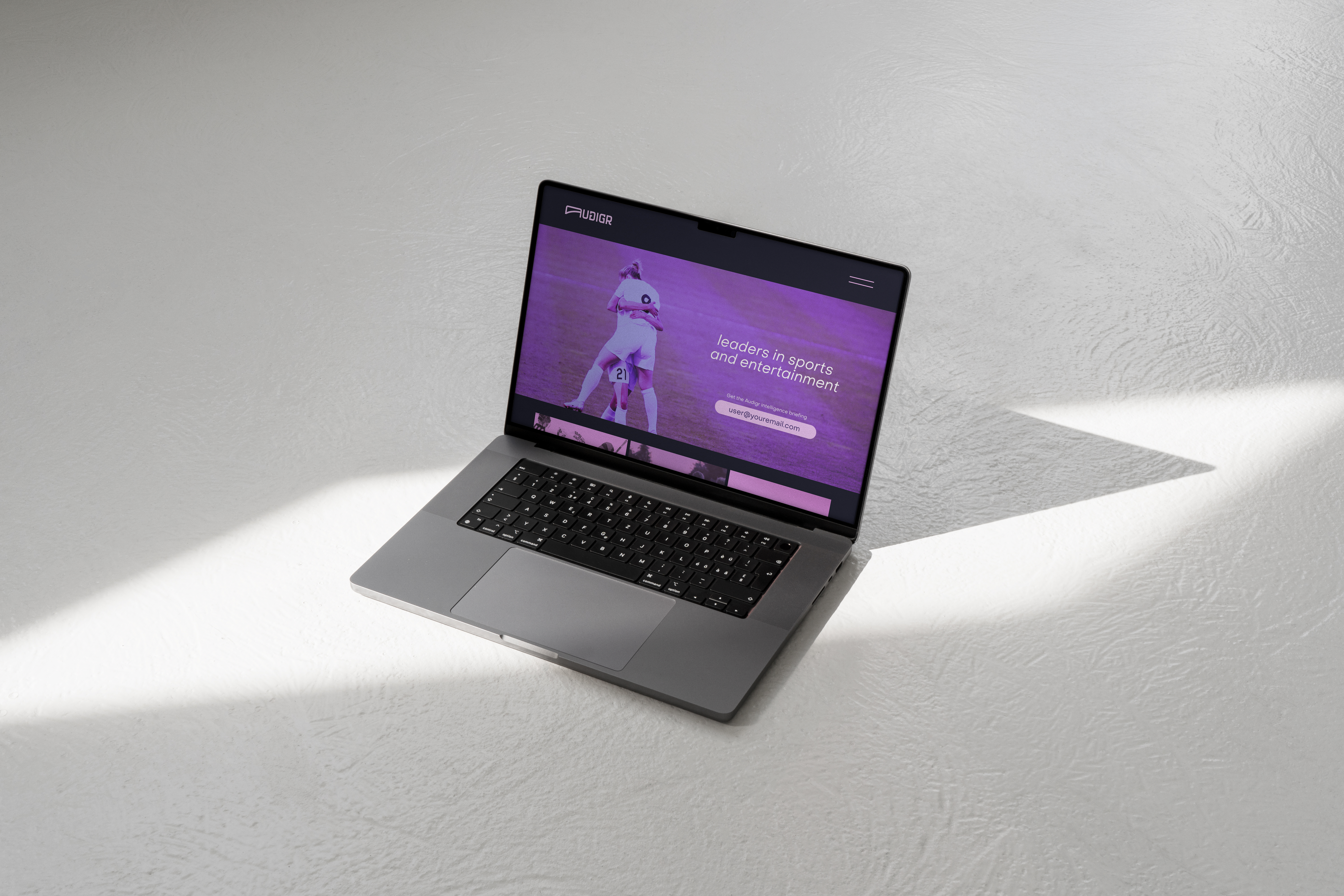
Audigr Group
Private client
San Antonio, Texas
2022
San Antonio, Texas
2022
Branding and creative direction for a global
sports investment firm.
The company, whose name is inspired by the Norse word for prosperity, has ambitions in many athletic properties throughout the world. The eventual use cases for the brand aren’t fully known, requiring flexibility and boldness to adapt to any circumstance.
In this spirit, the theme of this identity is ‘the goal’, rooting the brand in sport and establishing the shorthand ‘A’ symbol. This ‘A’ can perform dynamically as a motion graphic element, or fit a wide variety of layouts and contexts.
Finally, an extensive palette of violet, rose, and aqua tones ensure the brand stands out amongst its competitors

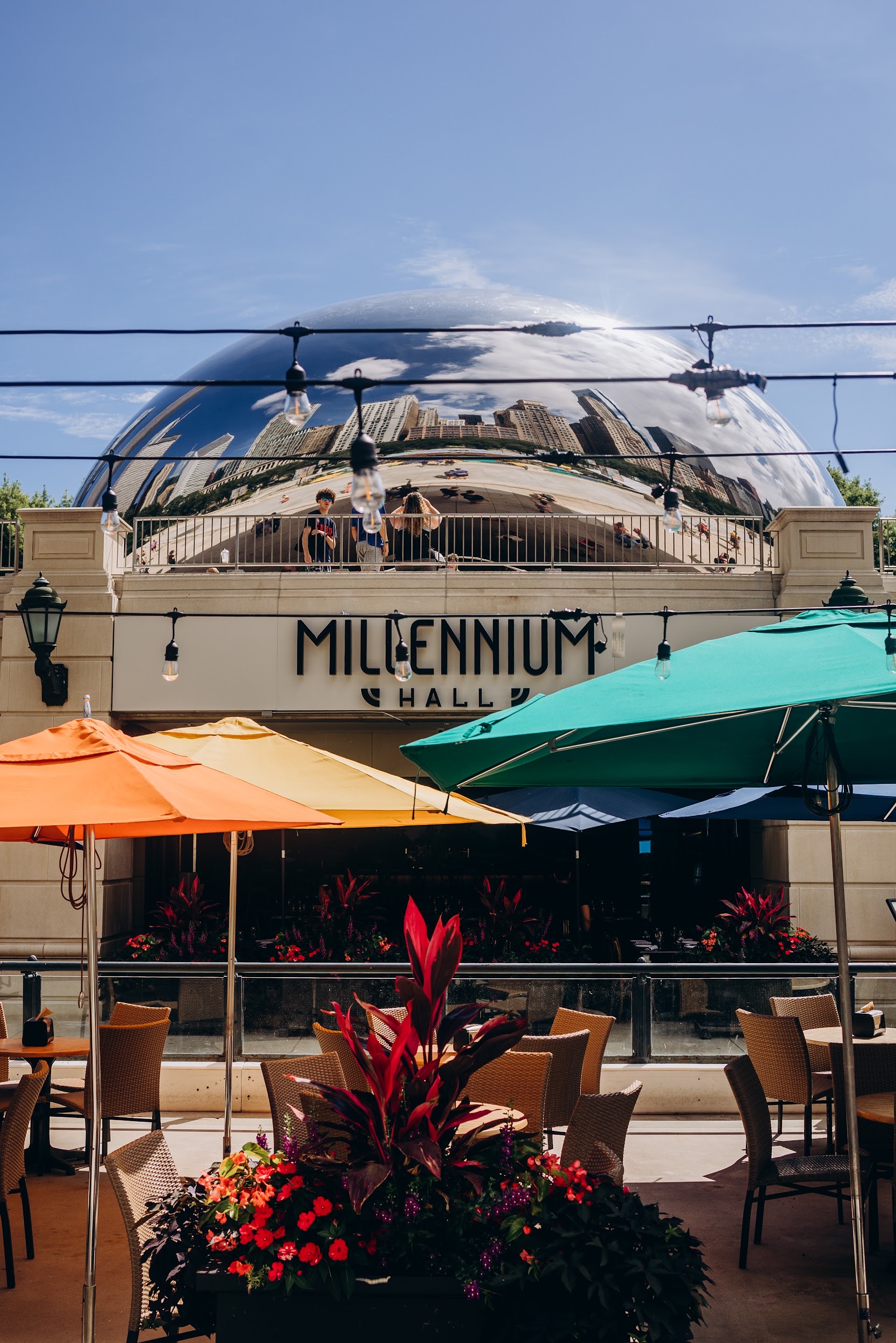
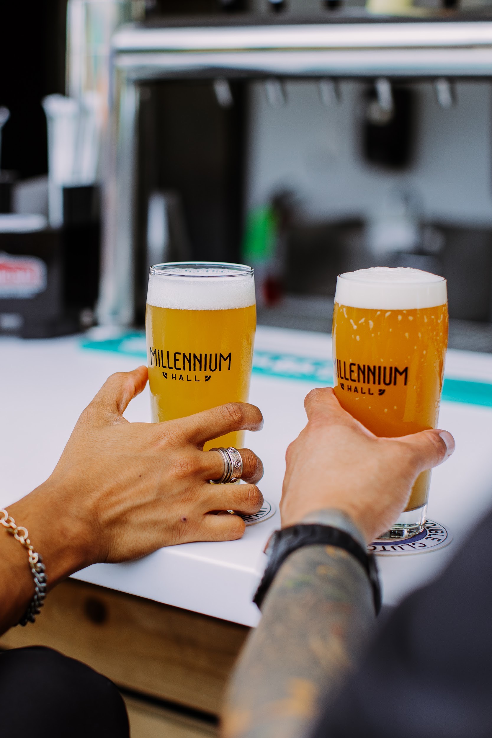
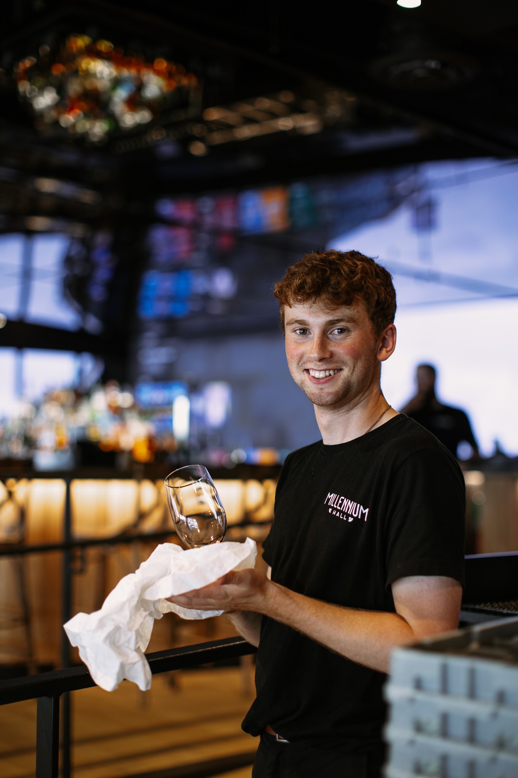
Millennium Hall
Vandalay Brands
Chicago, USA
2022
Chicago, USA
2022
Branding and creative direction for a Vandalay Brands restaurant at Millennium Park in Chicago.
With its prominent site, name recognition, and over one million visitors per year, this project demanded a significant attention to detail. The recognizable name and bold imagery tie the restaurant directly to the surrounding park and architectural features.
To tie together Millennium Hall’s multiple facilities, we drew custom lettering for wayfinding signage around the main restaurant and its auxillary pavillions and concessions in the park.


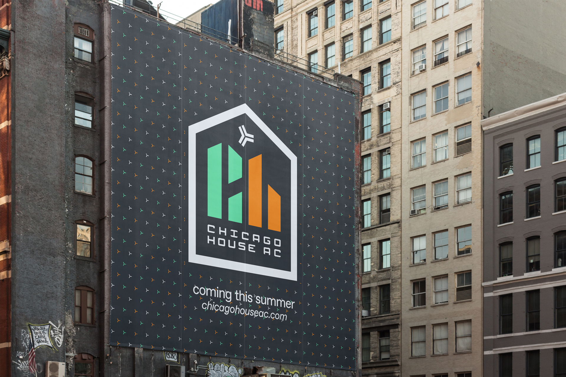
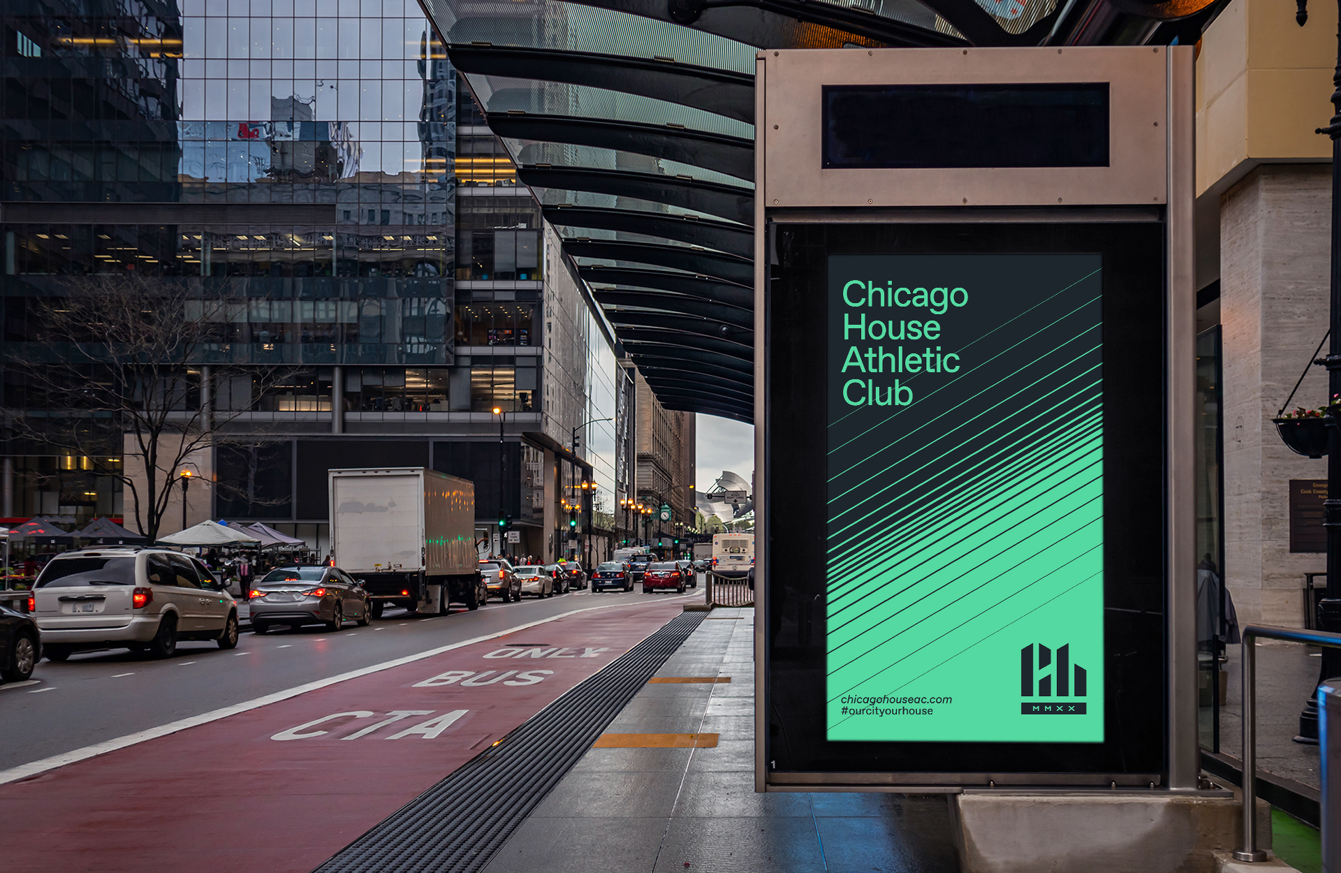
Chicago House Athletic Club
Chicago, USA
2020
2020
Branding lead, creative direction, and identity design for a professional soccer and multi-sport athletic club.
The name Chicago House Athletic Club and its visual identity were created in a four-month engagement process with players, staff, fans, and the community. 'House' commemorates the music genre originating in Chicago and as a symbol for the club's progressive stance and social-justice mission, being a 'home to all'.
Founded in 2020, the team competed in the NISA professional league from summer 2021. Its umbrella will expand to include amateur athletics in other sports.
Videos and motion graphics produced with Thatch Films, Chicago US. House Favorit typography courtesy of Dinamo Type Foundry, Basel CH.